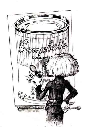
When I was a teenager, I went on a school trip to the Los Angeles Museum of Contemporary Art. The spiffy building they have now was not yet completed, so the collection was in a big warehousish space, known as the “Temporary Contemporary”. Between the charms of the name, and it actually being a pretty good space for art, many wags in LA said they hoped they would never finish the real building.
It was my first real exposure to contemporary art, and yeah, I thought it was mostly pretty dumb. (I have a finer appreciation for contemporary art now, though I still think it’s mostly pretty dumb.) Three things stand out in my memory.
One was a vivid purple plank leaning against the wall. The title was something like “Purple Plank”. I thought it was stupid. I still kind of think it was stupid. But I remember that thing, and everyone I’ve even spoken to who went to the museum during that era remembers it, too, so that’s … something.
One was a set of four canvasses, each painted a single colour. The first was a vivid chlorophyll green. The second was a bright yellow, tinged with a bit of green. The third was a rust color. The last was a pale grey. They weren’t quite solid colors: there was some texture and fine-grained combining of colours. There was that strong wow, look what you can do with paint sense about it. So I wanted to like it, but what were they paintings of? I looked at the title card, and laughed. “Seasons”. Okay, yeah.
The last thing that stands out in my memory was a big Warhol Campbell’s soup can print. At the time, it seemed dazzling in its dumbness. It’s a can of soup. So what?
Three or four years later, I’m in the grocery store, and there’s an aisle with a long row of Campbell’s soup: little perfectly matching red and white soldiers, all in a row, one after another after another after another. I pick one up, and notice for the first time how elegantly designed the can label really is. Nice. Then I realize that there’s a factory out there somewhere, making these adorable little sculptures — but that isn’t even the intent. The point is the soup. The handsome package is just an afterthought.

Boom. That’s what Warhol was trying to tell me. I wouldn’t have noticed if I hadn’t seen his print years earlier. It was just … time-release art.
Art is supposed to change the way you see; show you something the artist noticed and add it to the way you perceive things. Warhol explained that to me.
See also: there is no better Billionaire Phone, where I reference a relevant Warhol quote I found years later:
What’s great about this country is America started the tradition where the richest consumers buy essentially the same things as the poorest. You can be watching TV and see Coca-Cola, and you can know that the President drinks Coke, Liz Taylor drinks Coke, and just think, you can drink Coke, too. A Coke is a Coke and no amount of money can get you a better Coke than the one the bum on the corner is drinking. All the Cokes are the same and all the Cokes are good.

No comments:
Post a Comment
Note: Only a member of this blog may post a comment.